Selecting a colour scheme for your room can feel overwhelming. Daring to go bold or even choosing from the ever-expanding palette of neutrals can seem like an elusive decorating conundrum for even the most colour savvy decorator.
1. Harness Colourful Emotions!
Colour is a powerful tool. Research shows that colour can impact your mood in different ways. It’s also a powerful driver from the inside out; your preference for certain colour scheming can be a reflection of your personality. While many rooms you’ll paint or wallpaper will likely be some shade of white or neutral, it is possible to set your colour scheme in motion by thinking of your walls as your largest, most rousing palette. Don’t be afraid to experiment!
There are three main approaches, when it comes to integrating colour schemes into your home:
Monochromatic – Monochrome simply means using one dominating colour in a variety of tones, patterns and textures. This route is recommended for smaller spaces where you don’t want the walls to feel like they’re closing in on you. To avoid things becoming dull, add an accent colour for dimension.
Harmonious – Preferable for smaller rooms, this colour scheme works by combining closely related, complementary colours – those which appear side-by-side on the interior designer’s colour wheel. The adjacent colours balance and reinforce one another, adding contrast and depth. For example, create a calm, space-enhancing colour scheme by combining neutrals alone; think warm greys, earthy or nature-inspired neutrals.
Contrasting – This means choosing colours that appear on diametrically opposite sides of the colour wheel. Bold, lively colour combinations create drama and intensity, and help break up larger spaces so they don’t feel cavernous.
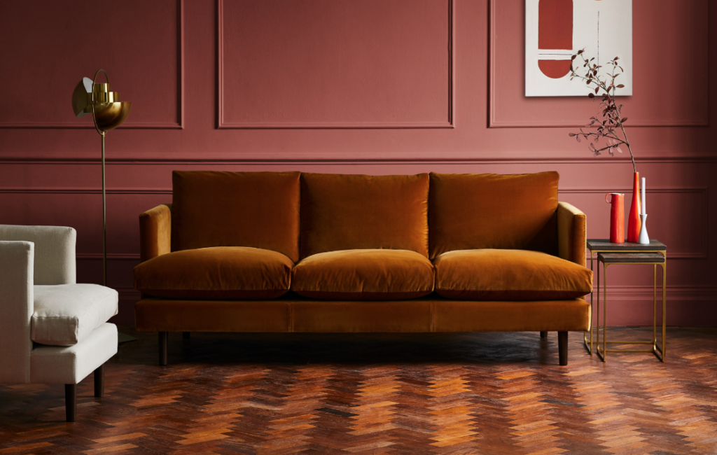
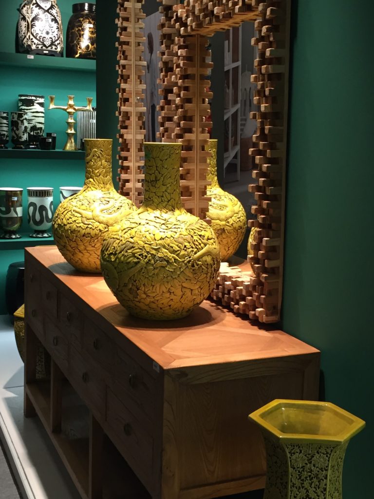
Left: The elegant ‘Clara’ sofa in a rich, russet velvet by Arlo & Jacob sits in a monochromatic scheme with subtle tonal and textural contrasts. Right: Greens and yellows sit close to each other on the colour wheel and this elegant but harmonious combination of jade and Imperial yellow reflects their shared colour properties.
2. Let There Be Light
Each room is uniquely affected by the aspect of your home. This can affect the temperature, but it also plays a crucial role in the way colour and light works in each room throughout the day and across the seasons. Selecting the paint colour for your living room could require a very different approach to the way you choose paint colours for your bedrooms.
Lose the chill from a north-facing room and create a sense of cosiness and intimacy by choosing from a palette of warm, ‘advancing’ colours such as russet or ochre.
Maximise light levels in a dark room by opting for a paint or wallpaper shade from the warmer end of the colour spectrum but keep it soft and pale if the room is small.
Overly bright, sunny rooms can be cooled down with pale, ‘receding’ colours. For smaller spaces with ample daylight, opt for nature-inspired blues or greens for a feeling of spacious, elegant calm.
Conversely, richly intense, ‘jewel box’ hues like deep turquoise or magenta are a brilliant choice for windowless rooms with a dearth of daylight.
Left: Textured, ochre walls add warmth to this north-facing corner. Right: Intensely-hued, magenta walls provide a richly pigmented and lively backdrop for a dining room sideboard.
3. Use Colour Correction
Colour is your friend when it comes to correcting and improving a room’s proportions or disguising certain elements.
Clever visual trickery can mitigate architectural imbalance. A white ceiling in a gloss finish, painted down to picture rail height helps disguise a lower-than average ceiling for example.
Perhaps unexpectedly, a dark glossy ceiling can actually have the same effect. Think of the night sky – it’s impossible to see where it begins and ends This requires a little bravery and you’ve got to have confidence with all the other elements in the room scheme and an overall vision of the completed space.
Conversely, painting the ceiling the same colour as the walls helps ‘lower’ a top heavy ceiling.
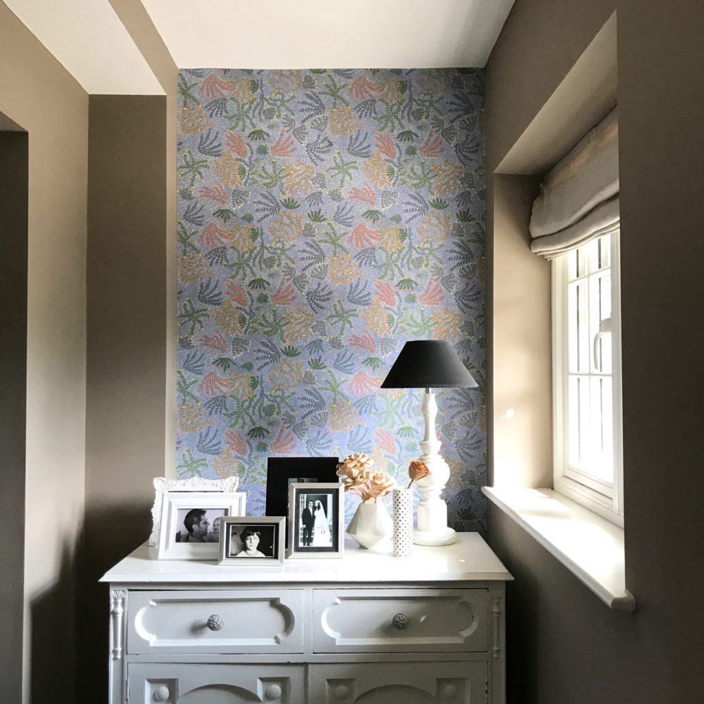
Bedrooms are usually the most straight-forward rooms to choose colours for. Most of the time they’re simply a rectangular room with four walls and a window. However, sloping eaves and awkward-angled corners – in a period cottage for example – can present a challenge. The right colours will improve and enhance a space, the wrong choices could simply highlight any imperfections.
Be clever about your choices. Perhaps opt for an all-over, small-scale, patterned wallpaper instead to disguise awkward contours – the busier the better.
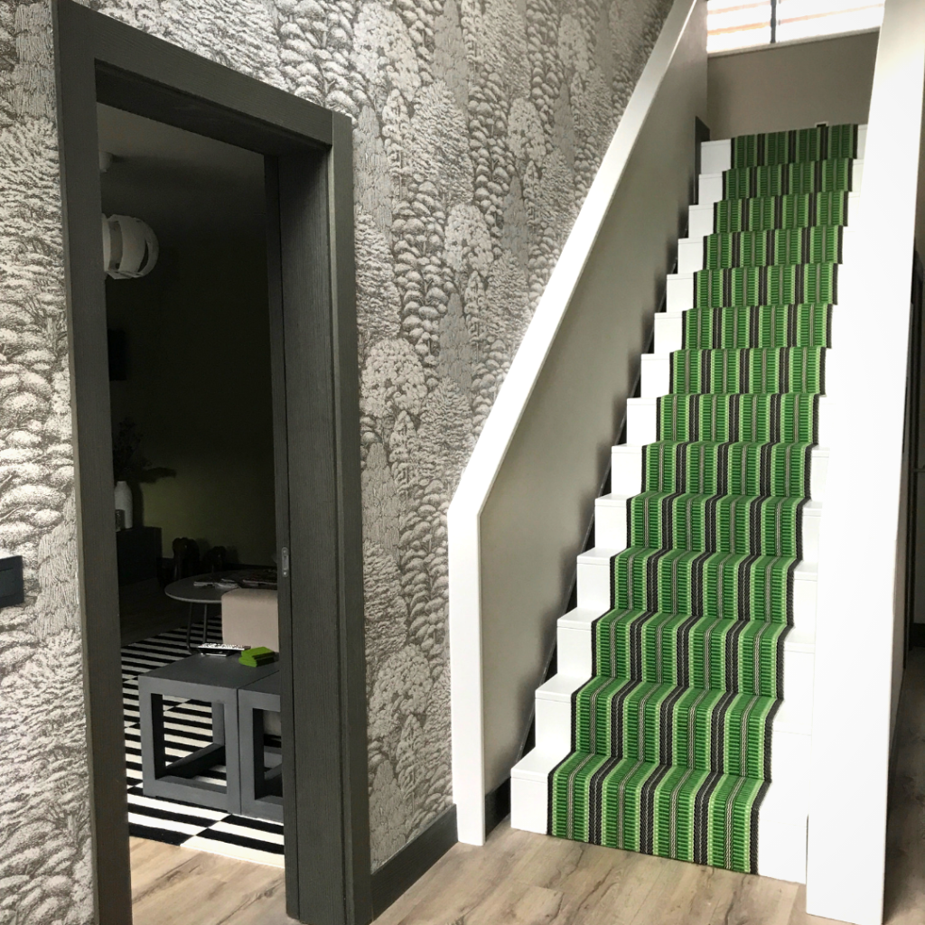
Left: Wallpapering the single end wall of this long, narrow hallway minimises its tunnel-like feel. The pattern and colours provide a visual ‘stop’ as well as decorative interest. Right: Charcoal grey skirtings and architraves provide definition, effectively framing the spaces in this modern build. They patterned wallpaper draws the eye upwards to fully appreciate the lofty, double-height proportions of the entrance hall. A green runner accents the cool, neutral scheme.
4. Make Sense Of The Whole
Make your colour scheming work harder for you by being clever with colour. You will improve the look and feel of each space by creating links between rooms to ensure a cohesive design narrative for your entire home.
A ‘universal colour palette’, for example, is something you can assemble in advance of choosing final wall colours. Essentially a toning palette of neutrals for woodwork and mouldings (skirting, architraves, doors and coving/cornice), that freshens and frames any of the three main types of colour scheme, promoting a harmony and ‘flow’ – that visual link between rooms. The universal colour palette acts as a background constant – a touchstone from which to extrapolate individual schemes.
Other accent colours can be black, white, neutral or the colours opposite your main room colour on the colour wheel. Used sparingly, they can really invigorate a room scheme. Think of accents as opposites; add warm accents to a cool scheme, cool accents to a warm scheme and bright accents to a neutral scheme.
White accents are a brilliant foil for bright hues, adding crisp definition, sparkle and freshness. Black accents should be used carefully. Done well, they lend definition and graphic edge to ‘sharpen up’ room schemes. Pale greys and beiges can be used to tone down strong colours.
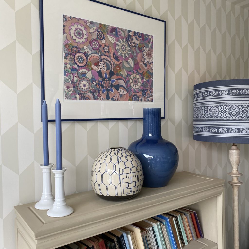
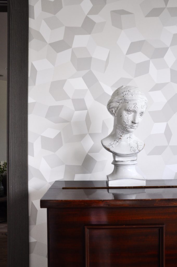
Left: Sky blue and soft pink hues warm up this warm, neutral scheme. Right: A cooler, greyer scheme is accented by the addition of warm, wood tones: the rich mahogany colour and patina of an antique, upright piano add depth and soul. The modern geometric wallpapers in both images are by Cole & Son. Shop our range for eclectic, one-off ceramics.
5. Turn To The Dark Side
Dark colours can be a game-changer but it does take nerve, especially on that first coat when the colour appears frightening in isolation. Adding furniture, shelves, mirrors and artwork will create a mitigating effect. The colour seems to magically recede and appears less dominant. The result however, is a powerful and soulful backdrop that sets colours alight and brings texture alive.
Reflective surfaces like silver frames, mirror-glass or crystal light fittings look more elegant against rich, dark walls. Built-in furniture can be an effective vehicle for dark colour; think painted woodwork in an inky, eggshell sheen. For example, painting open shelving in a darker hue presents a beautiful landscape for a collection or still life display.
In some cases, dark walls demand a contrasting pale floor, but bear in mind, a dark-polished or dark, glossy floor finish can actually bounce light around a space.
If you want to take the plunge colour matching is essential. Always view any colour samples (and that includes paint, wallpaper and indeed any surface textile or furnishing fabric) in both artificial and natural light, in the actual room you plan to decorate. Some colours can take on unexpected or unappealing casts in certain surroundings such as a barn conversion for example where an abundance of warm-hued wooden beams alter the appearance of colours. Subtly different pale greys cab be especially tricky to work with. Paint two-paint-layer metre squares where possible and live with the colour for a while before committing!
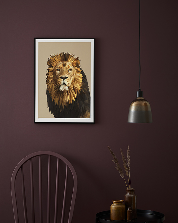
Left: A rich, burgundy backdrop provides the perfect foil for this majestic digital lion fine art portrait by Talia Giles. Right: Vivid Royal blue hues – matt painted walls and glossy, vintage coloured-glass, are accented and freshened by icy-white furniture and accessories.
Colour Scheming: Conclusions
While there may seem like a lot to consider, it’s worth taking your time to explore the possibilities when it comes to colour scheming. Be sure that your choices suit the unique properties of the room, your personality, and the context of your home. Don’t be afraid to experiment with bold hues and dark shades. But if you’re not quite ready to wear your heart on your walls, start small by adding colour and dynamics with furniture and accessories. Did you know that you can also browse by colour via our eclectic, online homewares store if you’re looking for quirky, decorative additions or globally-inspired pieces. Alternatively, sign up for our newsletter here to read future interior colour advice articles including how to balance colour proportions and great colour pairings. In the meantime – good luck with your colour scheming!
N.B. To get you started, here are some useful links to a range of well-known paint brands and other boutique suppliers worth browsing for subtle, nuanced palettes, bold, confident brights or rich, historic hues. Enjoy.
Andrew Martin; Craig & Rose; Crown; Designers Guild; Dulux; Farrow & Ball, Fired Earth; Lick; Little Greene; Mylands; Paint & Paper Library; Zoffany & Sanderson.
A note about the author…
Design By Origin’s’s focus is and will always be travel-infused interiors and ‘destination-inspired design’. However, generic blog features relating to interior design and decoration are relevant to all. Our founder’s creative head, background as an interiors magazine journalist (read more here), her experiences property developing, interior styling and designing for clients compels her to shout about what works and what doesn’t. The pitfalls to avoid and the absolute must-dos. It’s not comprehensive or exhaustive. However, she hopes to assist, just a little, with your decorating dilemmas going forwards.
Annabel Smith, Designs By Origin